
An open-source MCP server that gives your AI coding agent a visual canvas. Sketch the UI, review it in a browser, agree on the design — before any framework code gets written.
Contents: Viewer · Installation · Tools · Usage Example · Workflow · Development
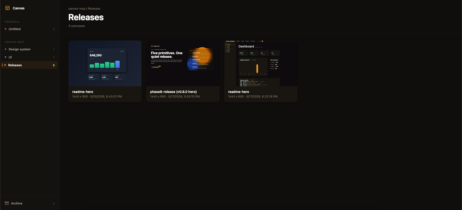
Above: the framesmith viewer. Workspaces and projects in the sidebar, canvases as live thumbnails on the right. AI agents create canvases via MCP tools; you browse them like Figma files.
MCP Client → stdio → framesmith server
                        ↓
              Scene Graph (in-memory JSON tree)
                        ↓
              HTML/CSS Renderer (inline styles)
                        ↓
              Puppeteer (headless Chromium → PNG)
Run npx -p framesmith framesmith-viewer to start the standalone browser viewer (default port 3001). Open any canvas to review it at multiple breakpoints, compare them side-by-side, inspect the underlying JSON, or archive / delete.
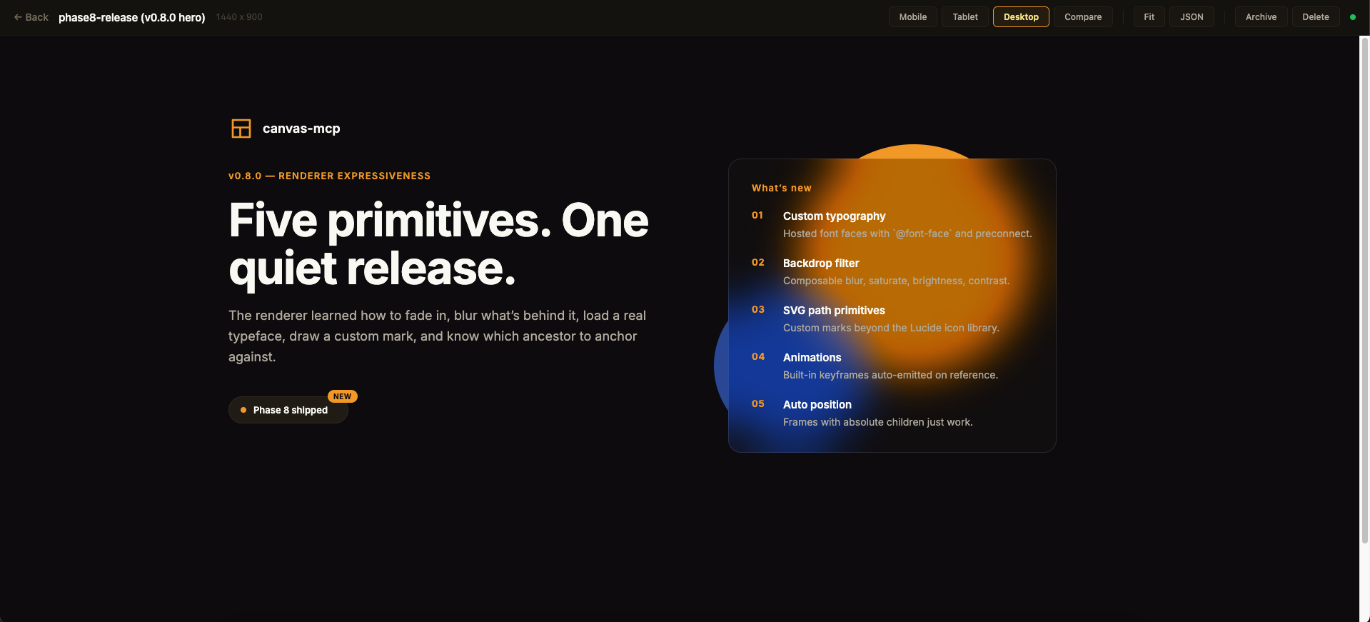
Above: a single canvas in the detail view. The toolbar across the top exposes the breakpoint preview modes, Compare for side-by-side rendering, Fit for max-width, JSON for the raw scene graph, and lifecycle actions.
The viewer is purely read-only — every canvas is authored through MCP tool calls from your AI assistant. Files persist to ~/.framesmith/canvases/ so the viewer keeps showing them across sessions.
No clone or build needed — register framesmith with your MCP client via npx (requires Node 20+).
claude mcp add framesmith -- npx -y framesmithAdd to ~/.codex/config.toml:
[mcp_servers.framesmith]
command = "npx"
args = ["-y", "framesmith"]Add to ~/.cursor/mcp.json (or per-project .cursor/mcp.json):
{
  "mcpServers": {
    "framesmith": {
      "command": "npx",
      "args": ["-y", "framesmith"]
    }
  }
}Add to ~/.codeium/windsurf/mcp_config.json:
{
  "mcpServers": {
    "framesmith": {
      "command": "npx",
      "args": ["-y", "framesmith"]
    }
  }
}Add to .vscode/mcp.json (project-scoped) or your global MCP settings:
{
  "servers": {
    "framesmith": {
      "command": "npx",
      "args": ["-y", "framesmith"]
    }
  }
}framesmith speaks standard stdio MCP. Point your client at npx -y framesmith using whatever config shape your client expects.
Optional: set
FRAMESMITH_VIEWER_URL=http://localhost:3001in the MCP server env to pin it to a long-lived standalone viewer process — see Running the viewer.
git clone https://github.com/vicmaster/framesmith.git
cd framesmith
npm install
npm run build
# then point your client at: node /path/to/framesmith/dist/index.jsCreate a new canvas. If projectId is omitted, it lands in the built-in Untitled project of the Personal workspace.
| Param | Type | Description |
|---|---|---|
name |
string? | Canvas name |
projectId |
string? | Target project. Defaults to the built-in Untitled project. See project_list. |
List canvases. Excludes archived canvases by default.
| Param | Type | Description |
|---|---|---|
projectId |
string? | Scope to one project |
includeArchived |
bool? | Include archived canvases (default false) |
Returns [{ id, name, createdAt, lastModified, projectId, archived }].
Canvas lifecycle. canvas_move reassigns a canvas to a different project. canvas_archive sets a soft-delete flag (canvas stays on disk, hidden from default canvas_list); canvas_unarchive clears it. canvas_delete removes the canvas and its file permanently — irreversible.
Get the URL of the live viewer plus per-canvas URLs. Share these with the user so they can open the design in their browser. No params.
{
  "url": "http://localhost:3001",
  "gallery": "http://localhost:3001",
  "canvases": [
    { "name": "Login", "viewer": "http://localhost:3001/canvas/abc123" }
  ]
}
canvas_create already returns the per-canvas viewer URL in its response; reach for viewer_url when you want the gallery URL or to enumerate every existing canvas's URL in one call.
Top-level container CRUD. The built-in Personal workspace cannot be deleted, and workspace_delete refuses if the workspace still contains projects (move or delete them first).
Mid-level container CRUD inside a workspace. The built-in Untitled project cannot be deleted. project_delete refuses if the project still contains any canvases (archived ones still count — move or delete them first).
Bind a workspace to the current project directory so its canvases live in the repo as open JSON — a .framesmith/ directory checked in alongside the code, instead of the global ~/.framesmith store. Run it once per repo.
| Param | Type | Description |
|---|---|---|
workspaceId |
string? | Workspace whose projects + canvases migrate into the repo. Defaults to the built-in Personal workspace. |
dir |
string? | Directory to bind. Defaults to the nearest git repo root above the server's working directory. |
It creates .framesmith/workspace.json (the binding plus the design system, so a fresh clone resolves tokens identically) and one subdirectory per project holding one slug-named file per canvas:
.framesmith/
  workspace.json     # workspace + projects[] + design system
  design-system/
    design-tokens.json
  ui/
    bloom-landing.json
    login-form.json
It migrates the workspace's projects + canvases in and makes the repo the source of truth for the rest of the session. A canvas is either repo-bound or global, never both. Afterwards the server auto-detects .framesmith/ on startup (walking up from its working directory). Commit .framesmith/ so designs travel with the code and diff cleanly in review.
The bind also records the repo in ~/.framesmith/registry.json, so the standalone viewer shows bound repos alongside your global workspaces in one gallery (it rebuilds that read-only mirror on launch and whenever the registry changes).
Execute operations on the scene graph. Operations are line-separated strings:
# Insert a frame into the document root
header=I("document", { type: "frame", layout: "horizontal", fill: "#1a1a2e", padding: 24, gap: 16, width: 1440, height: 80 })

# Insert text into the header
I(header, { type: "text", content: "My App", fontSize: 24, fontWeight: 700, color: "#ffffff" })

# Update a node
U("nodeId", { fill: "#e94560" })

# Delete a node
D("nodeId")

# Copy a node to a new parent
copy=C("sourceId", "parentId", { fill: "#0f3460" })

# Move a node
M("nodeId", "newParentId", 0)

# Replace a node entirely
R("nodeId", { type: "text", content: "Replaced" })
Node types: frame, text, rectangle, ellipse, image, icon, path, component, instance
Properties: fill, gradient, stroke, strokeWidth, cornerRadius, width, height, layout ("horizontal" | "vertical"), gap, padding, alignItems, justifyContent, fontSize, fontFamily, fontWeight, color, content, src, objectFit, opacity, shadow, shadows, blur, backdropBlur, backdropFilter, overflow, wrap, position, x, y, icon, iconSize, iconColor, d, viewBox, strokeLinecap, strokeLinejoin, animation, transition, componentId, overrides
Render canvas to PNG (returned as base64 image).
| Param | Type | Description |
|---|---|---|
canvasId |
string | Canvas ID |
nodeId |
string? | Specific node to capture |
width |
number? | Viewport width (default 1440) |
height |
number? | Viewport height (default 900) |
scale |
number? | Device scale (default 2) |
Read node data from the scene graph.
| Param | Type | Description |
|---|---|---|
canvasId |
string | Canvas ID |
nodeIds |
string[]? | Node IDs to read (default: root) |
maxDepth |
number? | Max traversal depth (default 5) |
Get computed bounding boxes via browser rendering.
| Param | Type | Description |
|---|---|---|
canvasId |
string | Canvas ID |
nodeId |
string? | Root node to start from |
maxDepth |
number? | Max depth (default 10) |
Read and write design tokens (colors, spacing, radius, typography). Use $tokenName in node properties to reference variables.
{
  "colors": { "primary": "#e94560", "bg": "#1a1a2e" },
  "spacing": { "sm": 8, "md": 16, "lg": 24 },
  "radius": { "sm": 4, "md": 8 }
}
Then use in nodes: { fill: "$primary", padding: "$md", cornerRadius: "$sm" }
Set tokens at the workspace level — every project + canvas under the workspace inherits them. Resolution order at render is canvas.variables (override) → project.designSystem → workspace.designSystem → built-in defaults, with the rightmost layer winning. Per-category merge: setting only colors doesn't reset spacing.
workspace_set_design_system({
  workspaceId: "...",
  variables: {
    colors: { primary: "#f59e0b", bg: "#0a0a0a" },
    spacing: { sm: 8, md: 16, lg: 24 }
  }
})
workspace_apply_preset({ workspaceId, preset }) is a shortcut that copies a named preset ("dark", "light", "material", "minimal") into the workspace.
Same shape, but at the project layer between workspace and canvas. Use for sub-brand overrides (e.g., a Marketing project that overrides one color while inheriting everything else from the workspace).
Register custom font faces on a canvas. The renderer emits @font-face blocks in <head> plus a <link rel="preconnect"> for unique remote origins, and declares font-display: swap so paint isn't blocked while a font loads.
{
  "fonts": [
    { "family": "Inter", "url": "https://fonts.gstatic.com/s/inter/v18/...regular.woff2", "weight": 400 },
    { "family": "Inter", "url": "https://fonts.gstatic.com/s/inter/v18/...bold.woff2",    "weight": 700 }
  ]
}
URLs must point at the binary (.woff2 / .woff / .ttf / .otf or a data: URI) — Google Fonts CSS stylesheet URLs (fonts.googleapis.com/css2) are not supported, use the gstatic.com binary URL directly. After registering, reference the family on any text node: fontFamily: "Inter, system-ui, sans-serif".
Export a canvas or specific nodes to files on disk.
| Param | Type | Description |
|---|---|---|
canvasId |
string | Canvas ID |
format |
string | "png", "jpeg", "webp", or "pdf" |
outputPath |
string | Directory to save files |
nodeIds |
string[]? | Specific nodes to export (default: full canvas) |
width |
number? | Viewport width (default 1440) |
height |
number? | Viewport height (default 900) |
scale |
number? | Device scale (default 2) |
List available style guide presets. No params. Returns preset names and descriptions.
Apply a style guide preset to a canvas. Merges preset design tokens into the canvas variables, and copies in any reusable components (button, card, badge) the preset defines so they can be instanced.
| Param | Type | Description |
|---|---|---|
canvasId |
string | Canvas ID |
preset |
string | Preset name: "dark", "light", "material", "minimal" |
Import a DESIGN.md file as a design system preset. Parses the Google Stitch format and extracts colors, typography, spacing, and border radius. It also extracts reusable component skeletons (button, card, badge) from the "Component Styling" section — apply_preset then makes them available as instanceable components on the canvas. After importing, use apply_preset to apply it to any canvas.
| Param | Type | Description |
|---|---|---|
content |
string? | Raw DESIGN.md content (provide this OR filePath) |
filePath |
string? | Absolute path to a DESIGN.md file |
name |
string? | Override the preset name |
Compatible with the 55+ design systems in awesome-design-md (Stripe, Notion, Figma, Vercel, Linear, etc.).
Render a canvas at multiple viewport sizes. Defaults to mobile (390x844), tablet (768x1024), and desktop (1440x900).
The renderer emits clamp() for paddings ≥ 32px and font sizes ≥ 24px, so headlines and large spacing shrink proportionally at narrower viewports (assuming a 1440px design width). Smaller values stay static.
| Param | Type | Description |
|---|---|---|
canvasId |
string | Canvas ID |
breakpoints |
array? | [{label, width, height}] — custom breakpoints |
scale |
number? | Device scale (default 2) |
Compare two canvases visually. Returns a diff image with changed regions highlighted in red.
| Param | Type | Description |
|---|---|---|
canvasId1 |
string | First canvas ID |
canvasId2 |
string | Second canvas ID |
width |
number? | Viewport width (default 1440) |
height |
number? | Viewport height (default 900) |
scale |
number? | Device scale (default 1) |
Auto-score a design against quality heuristics. Returns an overall score (0–100), per-category scores, and per-node actionable issues. Designed for generator-evaluator loops: build with batch_design, score with canvas_evaluate, fix the issues targeting the returned nodeIds, repeat.
| Param | Type | Description |
|---|---|---|
canvasId |
string | Canvas ID to evaluate |
mode |
"fast" | "detailed" | "llm" |
"fast" = JSON-tree analysis only (<100ms). "detailed" adds Puppeteer-based pixel-level overlap checks. "llm" runs fast-mode heuristics plus a vision-model critique (provider picked from FRAMESMITH_LLM_PROVIDER or whichever of ANTHROPIC_API_KEY / OPENAI_API_KEY is set — costs one paid API call per invocation). Default "fast". |
categories |
string[]? | Subset of spacing, color, typography, structure, consistency. Defaults to all. |
Categories and what they check
| Category | Weight | Checks |
|---|---|---|
spacing |
20 | Off-scale padding/gap values, too many unique spacing values |
color |
25 | WCAG AA contrast ratios for text against nearest background |
typography |
20 | Type-scale ratios (1.15–1.75), font-family count, weight variation |
structure |
15 | Tree depth, naming coverage, design-token usage %, component reuse |
consistency |
20 | Frames missing layout, inconsistent sibling padding, sibling overlap (detailed mode) |
Return shape
{
  "overallScore": 87,
  "categories": [{ "name": "spacing", "score": 90, "issueCount": 1, "weight": 20 }],
  "issues": [
    {
      "category": "color",
      "severity": "error",
      "nodeId": "abc123",
      "message": "Text \"Sign In\" has contrast ratio 2.8:1 against #1a1a2e. WCAG AA requires 4.5:1.",
      "suggestion": "Increase contrast by darkening/lightening the text or background."
    }
  ],
  "summary": "Overall quality: Good (87/100). Strongest: spacing (90/100). Weakest: color (75/100)...",
  "stats": { "totalNodes": 14, "textNodes": 5, "frameNodes": 8, "maxDepth": 4, "tokenUsagePercent": 61, "componentReusePercent": 0 },
  "mode": "fast"
}
With mode: "llm", the response additionally carries:
{
  "llmCritique": {
    "provider": "anthropic",
    "model": "claude-sonnet-4-6",
    "score": 84,
    "summary": "Clean dashboard layout with a strong primary metric and clear hierarchy.",
    "strengths": ["balanced spacing", "consistent type scale"],
    "weaknesses": ["stat tiles sit slightly below the card's baseline"],
    "suggestions": ["align the stat row to the card's bottom edge for a tighter composition"]
  }
}
Provider selection: FRAMESMITH_LLM_PROVIDER env var (anthropic | openai), else falls back to whichever of ANTHROPIC_API_KEY / OPENAI_API_KEY is set. Default models: claude-sonnet-4-6 / gpt-4.1 (override via FRAMESMITH_LLM_ANTHROPIC_MODEL / FRAMESMITH_LLM_OPENAI_MODEL). Adding a third provider is one entry in the judges table in src/llm-judge.ts.
Example generator-evaluator loop
batch_design({ canvasId, operations: "..." })
const r = canvas_evaluate({ canvasId, mode: "fast" })
// r.issues[].nodeId points to exactly what to fix
batch_design({ canvasId, operations: `U("${r.issues[0].nodeId}", { color: "#ffffff" })` })
canvas_evaluate({ canvasId })  // re-score
Issues that have a mechanical fix come back with an extra fix: { op, rationale } field — see canvas_autofix below.
Runs canvas_evaluate in fast mode and returns just the subset of issues with a mechanically derived fix — no judgement calls. Each fix carries a ready-to-paste batch_design Update op string. Closes the generator-evaluator loop without a second AI hop.
| Param | Type | Description |
|---|---|---|
canvasId |
string | Canvas to autofix |
categories |
string[]? | Restrict to fixes from these categories (default: all) |
What gets auto-fixed
- Spacing — off-scale
gapor scalarpaddingsnaps to the nearest scale value. Arraypaddingis skipped (ambiguous which index). - Consistency — frames with multiple children but no
layoutgetlayout: "vertical". - Color — recoverable WCAG contrast failures get
color: "#000000"or"#FFFFFF", whichever wins against the resolved background. Failures so bad that neither black nor white meets the threshold are not auto-fixed (the background also needs to change).
Return shape
{
  "totalIssues": 18,
  "fixableCount": 5,
  "fixes": [
    {
      "nodeId": "abc123",
      "category": "color",
      "op": "U(\"abc123\", { color: \"#000000\" })",
      "rationale": "Switch text color to #000000 for WCAG AA contrast against #F8FAFC",
      "message": "Text \"Sign In\" has contrast ratio 2.8:1 against #F8FAFC. WCAG AA requires 4.5:1."
    }
  ]
}
Apply the ops by joining them with newlines and passing to batch_design, then re-evaluate.
framesmith://guidelines— markdown authoring guide: width strategies (fixed / percentage / fluid+cap / floor / fit-content), responsive hint semantics (stack/wrap/fixed), common patterns (pricing tiers, two-column hero, tag list, toolbar), and anti-patterns. Source:docs/GUIDELINES.md.
npm run bench runs canvas_evaluate over a fixed corpus of canvases (a high-quality dashboard hero, a minimal well-formed canvas, an intentional-contrast-failure canvas) and diffs the result against benchmark/baselines.json. Catches drift in scoring across renderer / evaluator changes — exit code is nonzero on any score, issue-count, or issue-message change. Re-baseline with npx tsx benchmark/run.ts --update after intentional evaluator rewrites.
Nodes support linear and radial gradients via the gradient property:
# Linear gradient (angle in degrees)
I("parent", { type: "frame", width: 400, height: 200, gradient: { type: "linear", angle: 135, stops: [{color: "#667eea", position: 0}, {color: "#764ba2", position: 100}] } })

# Radial gradient
I("parent", { type: "frame", width: 200, height: 200, gradient: { type: "radial", stops: [{color: "#fff", position: 0}, {color: "#000", position: 100}] } })
When gradient is set, it takes precedence over fill. Both can coexist (fill as fallback).
Structured shadows, blur filters, and backdrop blur:
# Structured shadow (supports multiple shadows)
I("parent", { type: "frame", fill: "#fff", shadows: [{x: 0, y: 4, blur: 12, spread: 0, color: "rgba(0,0,0,0.15)"}] })

# Blur filter
I("parent", { type: "frame", fill: "#3b82f6", blur: 4 })

# Backdrop blur (single-function shorthand for `blur`)
I("parent", { type: "frame", fill: "rgba(255,255,255,0.5)", backdropBlur: 8 })

# Glassmorphism (composable backdrop-filter: blur + saturate + brightness + contrast)
I("parent", {
  type: "frame",
  fill: "rgba(255, 255, 255, 0.4)",
  backdropFilter: { blur: 12, saturate: 180, brightness: 110 }
})
The structured backdropFilter form takes precedence over backdropBlur when both are set. The renderer also emits the -webkit-backdrop-filter prefix so glass effects render in Safari/iOS without extra work.
The legacy shadow string property still works for simple cases.
1,900+ icons from Lucide are available via the icon node type:
I("parent", { type: "icon", icon: "search", iconSize: 24, iconColor: "#888" })
I("parent", { type: "icon", icon: "heart", iconSize: 32, iconColor: "#ef4444" })
Icons render as inline SVGs with configurable size and color.
For custom shapes and brand marks beyond the Lucide library, use the path node type with a raw SVG d attribute:
I("parent", { type: "path", width: 24, height: 24,
  d: "M 12 2 L 22 22 L 2 22 Z", fill: "#f59e0b" })

# With stroke + viewBox (defaults to `0 0 width height`)
I("parent", { type: "path", width: 48, height: 48, viewBox: "0 0 24 24",
  d: "M 12 2 L 22 22 L 2 22 Z",
  fill: "none", stroke: "#000", strokeWidth: 2,
  strokeLinecap: "round", strokeLinejoin: "round" })
fill/stroke/strokeWidth apply to the path itself (not the wrapper). d and viewBox are validated for safe characters — anything that could break out of the attribute is rejected.
Reference a built-in keyframe to make a node animate in on page load. The renderer auto-emits the @keyframes block only when referenced.
I("hero", { type: "frame", animation: { name: "fadeIn", duration: 400 } })
I("title", { type: "text", animation: { name: "slideUp", duration: 300, delay: 100 } })
Built-in keyframe names: fadeIn, slideUp, slideDown, scaleIn. All end at the natural resting state with animation-fill-mode: both, so the start state applies pre-animation and the end state sticks after.
animation: { name, duration?: 300ms, delay?: 0ms, easing?: "ease-out", iteration?: 1 | "infinite" }. Easing is whitelisted: ease, ease-in, ease-out, ease-in-out, linear (anything else falls back to ease-out).
transition: { property?: "all", duration, easing?: "ease", delay?: 0ms }. Transitions only fire on state change, so they're inert until interactive states exist in the renderer — included today so a future hover/focus PR has a place to land.
Define reusable components and create instances with overrides:
# Define a component (a frame subtree that gets registered)
card=I("document", { type: "component", name: "Card", width: 300, fill: "#1a1a1a", cornerRadius: 12, layout: "vertical", padding: 16, gap: 8 })
I(card, { type: "text", name: "title", content: "Default Title", fontSize: 20, color: "#fff" })
I(card, { type: "text", name: "subtitle", content: "Default subtitle", fontSize: 14, color: "#888" })

# Create instances with overrides (matched by child name)
I("document", { type: "instance", componentId: card, overrides: { title: { content: "My Card" }, subtitle: { content: "Custom text" } } })
Here's a complete session building a login card:
1. Create a canvas and set design tokens
canvas_create({ name: "Login" })
→ {
    "canvasId": "abc123",
    "rootId": "xyz789",
    "name": "Login",
    "projectId": "default-project",
    "viewerUrl": "http://localhost:3001/canvas/abc123",
    "galleryUrl": "http://localhost:3001"
  }

set_variables({
  canvasId: "abc123",
  variables: {
    colors: { bg: "#0a0a0a", surface: "#1a1a2e", accent: "#e94560", text: "#ffffff" },
    spacing: { sm: 8, md: 16, lg: 24, xl: 32 },
    radius: { md: 8, lg: 16 }
  }
})
2. Build the layout with batch_design
batch_design({
  canvasId: "abc123",
  operations: `
    page=I("document", { type: "frame", width: 1440, height: 900, fill: "$bg", layout: "vertical", alignItems: "center", justifyContent: "center" })
    card=I(page, { type: "frame", width: 400, fill: "$surface", cornerRadius: "$lg", padding: [32, 32, 32, 32], layout: "vertical", gap: 24 })
    I(card, { type: "text", content: "Sign In", fontSize: 28, fontWeight: 700, color: "$text" })
    I(card, { type: "frame", width: "100%", height: 44, fill: "#ffffff10", cornerRadius: "$md", padding: [0, 16, 0, 16], layout: "horizontal", alignItems: "center" })
    I(card, { type: "frame", width: "100%", height: 44, fill: "#ffffff10", cornerRadius: "$md", padding: [0, 16, 0, 16], layout: "horizontal", alignItems: "center" })
    btn=I(card, { type: "frame", width: "100%", height: 44, fill: "$accent", cornerRadius: "$md", layout: "horizontal", alignItems: "center", justifyContent: "center" })
    I(btn, { type: "text", content: "Continue", fontSize: 16, fontWeight: 600, color: "$text" })
  `
})
3. Take a screenshot to see the result
screenshot({ canvasId: "abc123" })
→ returns base64 PNG image
4. Iterate — update the button color and verify
batch_design({
  canvasId: "abc123",
  operations: `U("btn-id", { fill: "#3b82f6" })`
})

screenshot({ canvasId: "abc123" })
The viewer runs in one of two modes — embedded (auto-starts inside the MCP server process) or standalone (long-lived in its own terminal). Standalone is recommended; the embedded mode stops the moment your MCP session ends, so any viewer URL you shared becomes unreachable.
# In a separate terminal tab — stays alive independently of any MCP session
npx -p framesmith framesmith-viewer

# Or on a specific port
npx -p framesmith framesmith-viewer 3004
Working from a clone instead of npm? Run
npm run viewer(ornpm run viewer -- 3004) from the repo root — same standalone viewer, run from source.
The standalone viewer:
- Persists across sessions — URLs keep working after Claude / Cursor / Windsurf finishes
- Shared across projects — multiple MCP sessions (from different projects) all use the same viewer
- Auto-detects new canvases — watches
~/.framesmith/canvases/for changes and picks them up immediately - Auto-detected by MCP — when the MCP server starts, it probes for a running standalone viewer and uses it instead of starting its own
- Gallery (
/) — browse all canvases as clickable cards with live thumbnails - Project (
/project/:id) — same gallery but scoped to one project - Archive (
/archive) — soft-deleted canvases with restore / permadelete actions - Canvas detail (
/canvas/:id) — full rendered design with responsive viewport buttons (Mobile / Tablet / Desktop), Compare mode, Fit toggle, and JSON inspector - Raw HTML (
/canvas/:id/html) — the rendered HTML for embedding or inspection - JSON API (
/api/canvases,/api/canvas/:id/meta) — programmatic access - Live auto-refresh — the viewer polls for changes every 2 seconds, so the browser updates automatically as your agent runs
batch_design
All canvases persist to ~/.framesmith/canvases/ as JSON files and survive process restarts. Set FRAMESMITH_VIEWER_URL in the MCP server env to point at a viewer running on a non-default port.
- Start the standalone viewer in a terminal tab:
npx -p framesmith framesmith-viewer canvas_create→ get canvas ID- Open the viewer URL in your browser for live preview
apply_presetorset_variables→ set up design tokensbatch_design→ build the UI with frames, text, icons, components, gradients- Watch the viewer auto-refresh as you design
screenshot_responsive→ preview at mobile/tablet/desktop sizescanvas_diff→ compare before/after changes visuallyexport→ save final designs to PNG/PDF files
git clone https://github.com/vicmaster/framesmith.git
cd framesmith
npm install
npm run build| Command | What it does |
|---|---|
npm run build |
Compile TypeScript to dist/. Required before the installed MCP server picks up changes — it loads dist/index.js. |
npm run dev |
Run the server directly via tsx for local iteration. Does not affect the registered MCP server. |
npm run viewer [port] |
Start the standalone viewer (default auto-picks from 3001). |
npx tsx test-*.ts |
Run ad-hoc test scripts at the repo root. |
| Variable | Purpose |
|---|---|
FRAMESMITH_VIEWER_URL |
Point the MCP server at an external viewer (skips starting an embedded one). |
FRAMESMITH_VIEWER_PORT |
Override the standalone viewer's port. |
- ESM only (
"type": "module"). Imports in TypeScript source use.jsextensions even when the source file is.ts. - Don't edit
dist/— it's regenerated bytsc. - New MCP tool? Register it in
src/index.ts, document it in the Tools section above, and updateVISION.md's phase checklist.
MIT — see LICENSE.
Copyright (c) 2026 Victor Velazquez.